Designing One Scalable System Across Three Creative Apps
How I led a 14-person team to unify Slideshow Maker w Music and Color Pop under a single design system used by millions worldwide.
Role
Product Design Lead
Owned the entire design process & product strategy
Timeline
2016 – 2023
7 years of continuous iteration
Tools
Figma, FigJam, Adobe Suite
Firebase Analytics, ClickUp
Context & Scope
This case study represents one design systems initiative spanning three separate apps, each with different audiences, feature depth, and creative workflows.
While these products served different use cases, slideshows, photo editing, and video creation, they shared a growing challenge:
Inconsistent UI, duplicated effort, and poor scalability across teams.
As usage grew into the tens of millions, design decisions made in isolation began to slow development, confuse users, and dilute brand trust.
This project became less about individual features, and more about building a system that could scale across products, teams, and time.
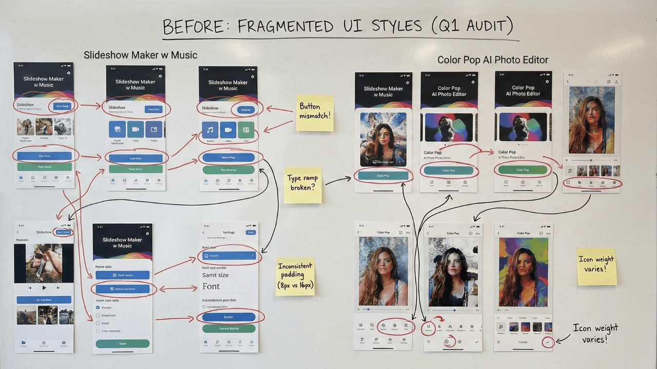
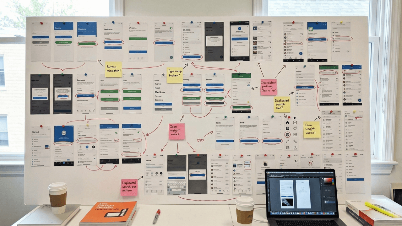
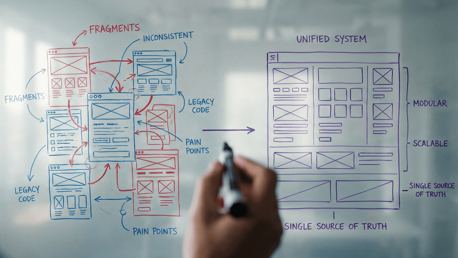
The Problem
Before the design system, each app evolved independently.
That resulted in:
- Multiple button styles solving the same problem
- Inconsistent navigation and iconography across apps
- Designers recreating components instead of improving experiences
- Developers rebuilding UI logic repeatedly
- Slow onboarding for new team members
Users noticed the inconsistency.
Teams felt the inefficiency.
We needed a single source of truth, one that balanced flexibility for different products with consistency across the ecosystem.
User Personas
The Passionate Editor
Advanced creator using Slideshow Maker for professional or semi-professional content.
Frustration
“Frustrated by shallow or rigid tools”
The Casual Creator
Social-first user using Color Pop for quick, shareable results.
Behavior
“Leaves quickly if confused”
Design System Implication
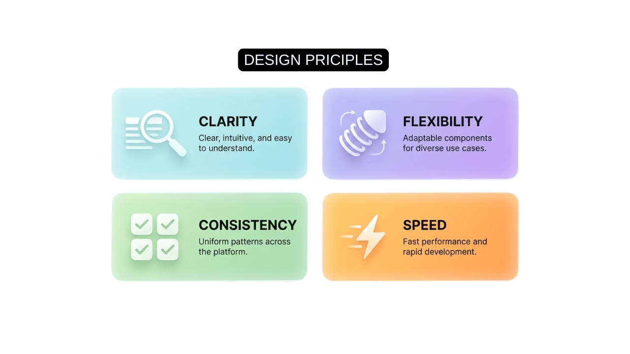
We designed components that scale in complexity, simple by default, powerful when expanded.
Strategy
Instead of redesigning apps independently, I led the team to pause feature work and invest in a shared design foundation.
The strategy:
This approach ensured every future feature improved the system, not fragmented it.
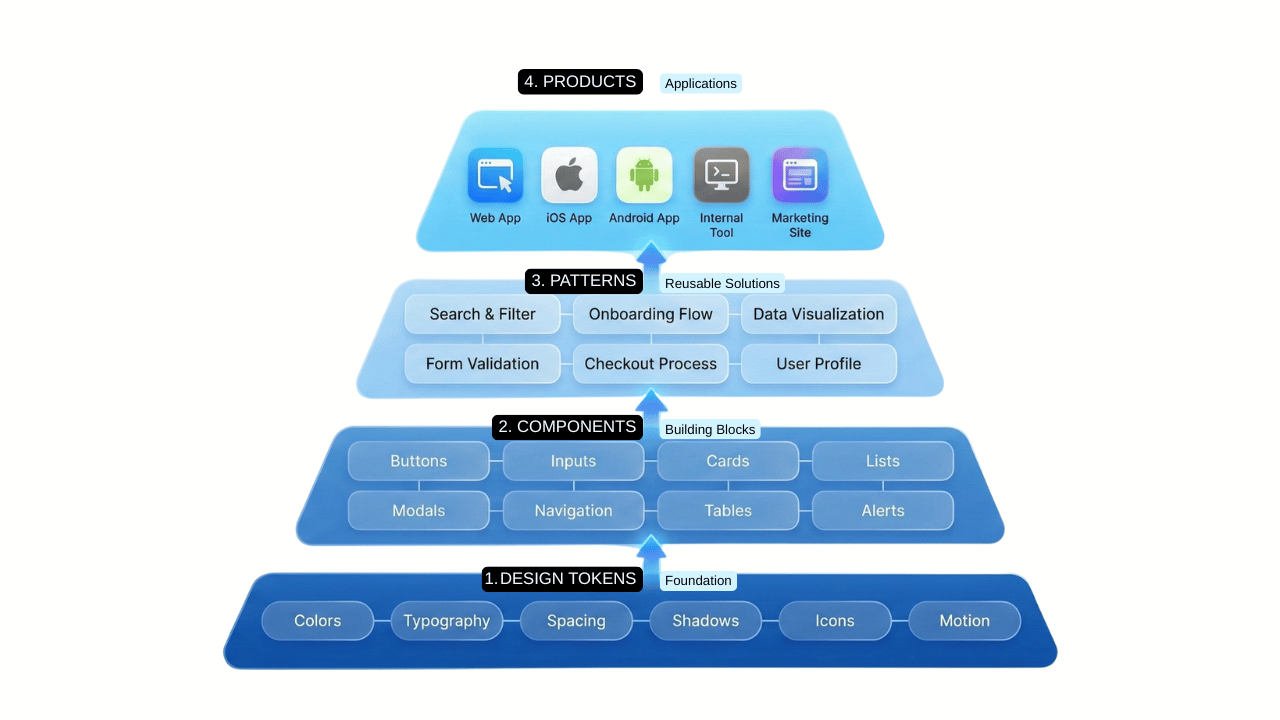
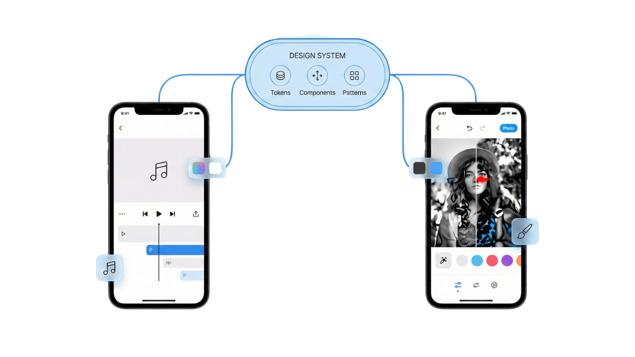
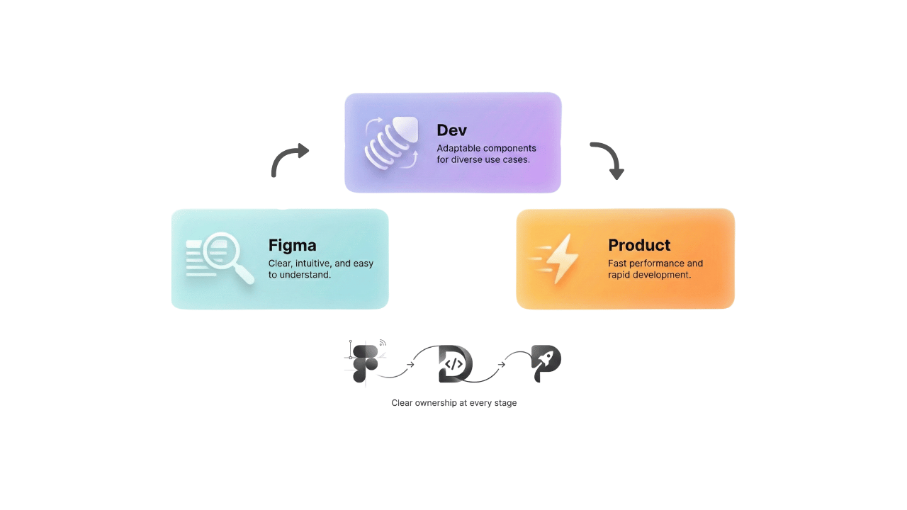
The System
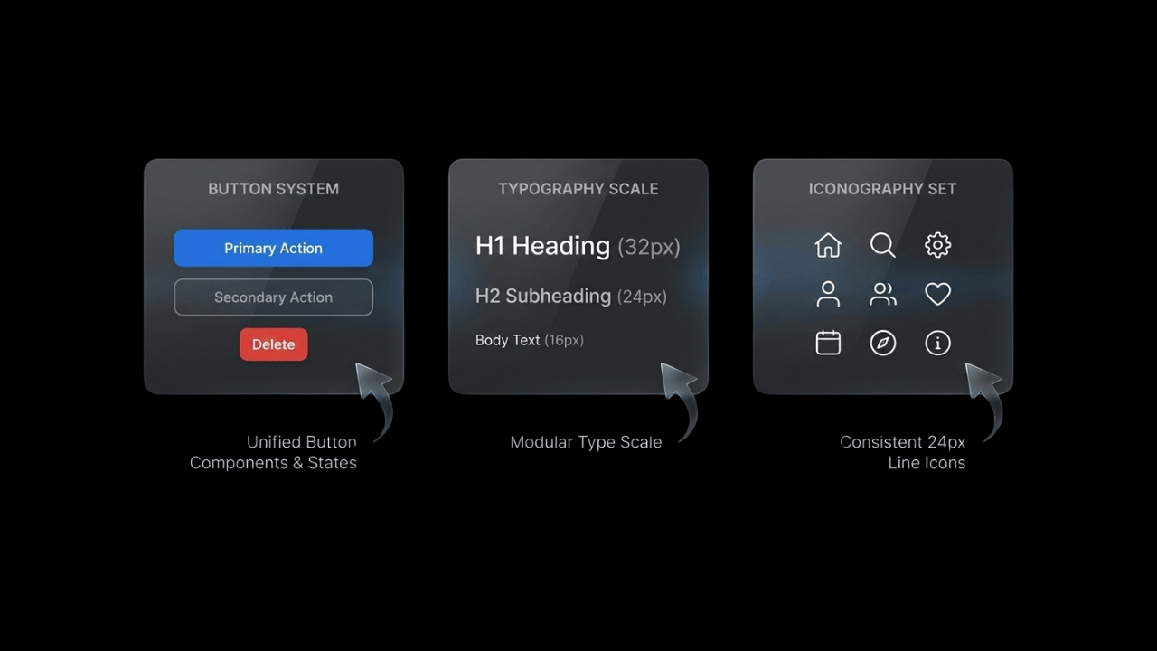
We built a comprehensive design system in Figma, supported by Illustrator and After Effects for visual and motion consistency.
System Elements
- Design tokens (color, typography, spacing)
- Reusable components with variants
- Motion and interaction guidelines
- Cross-app iconography
- Responsive layout rules
System Support
Slideshow Maker
Feature-rich flows with deep customization
Color Pop
One-tap AI interactions for instant results
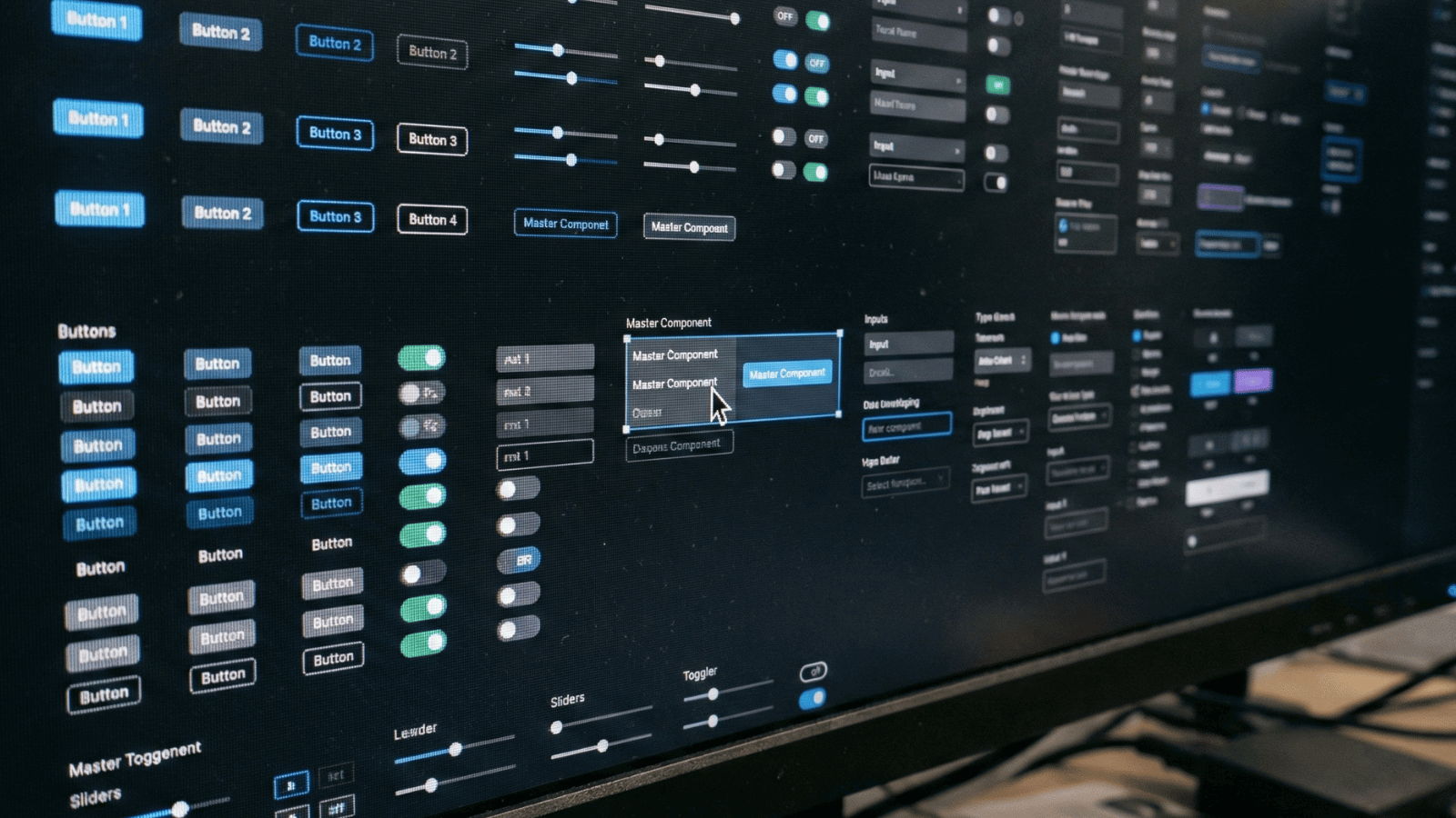
Figma Component Library
Design Tokens
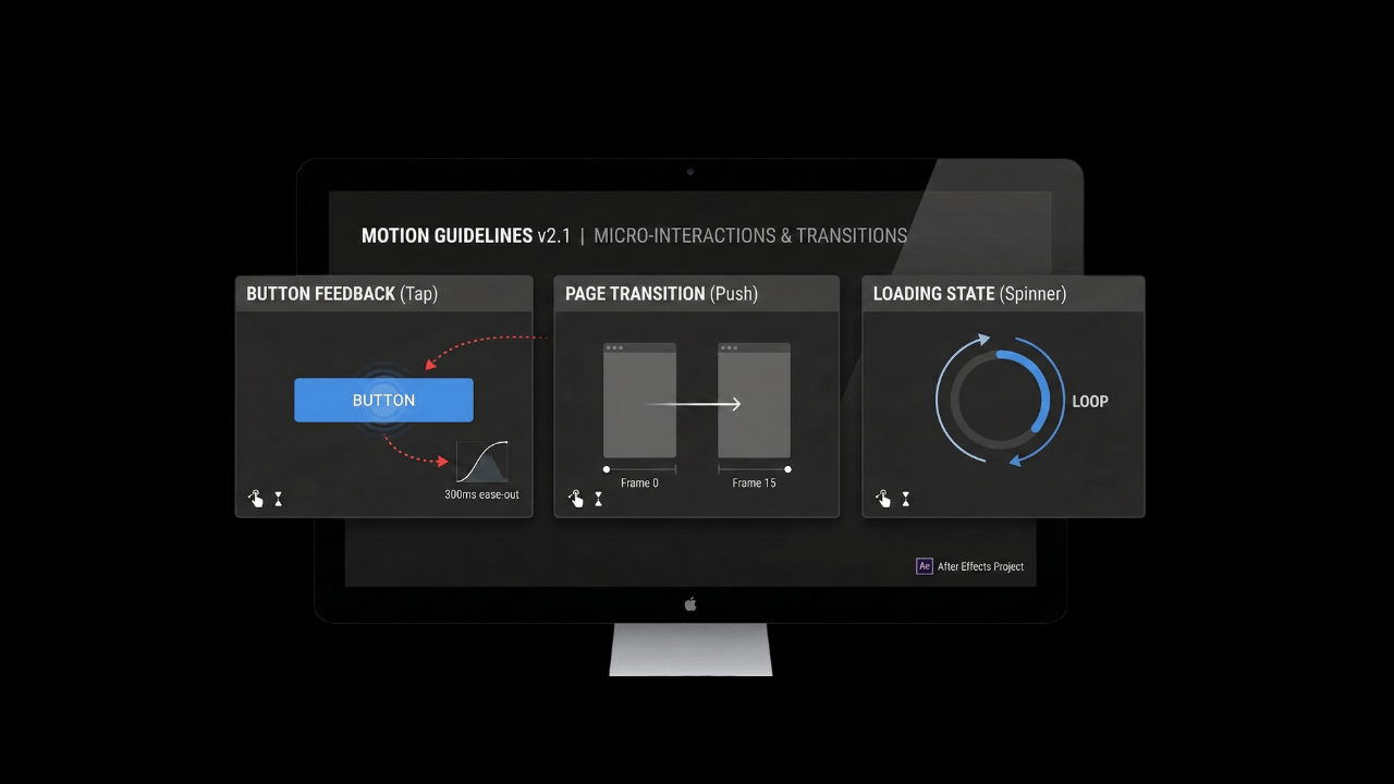
Motion Guidelines
Adaptation
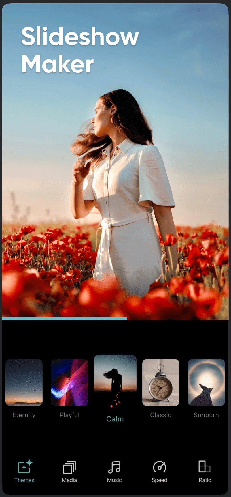
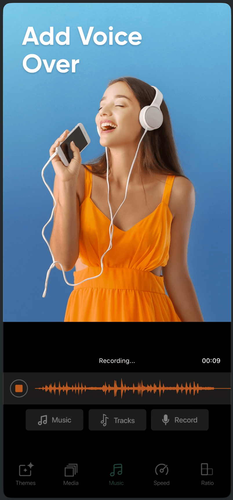
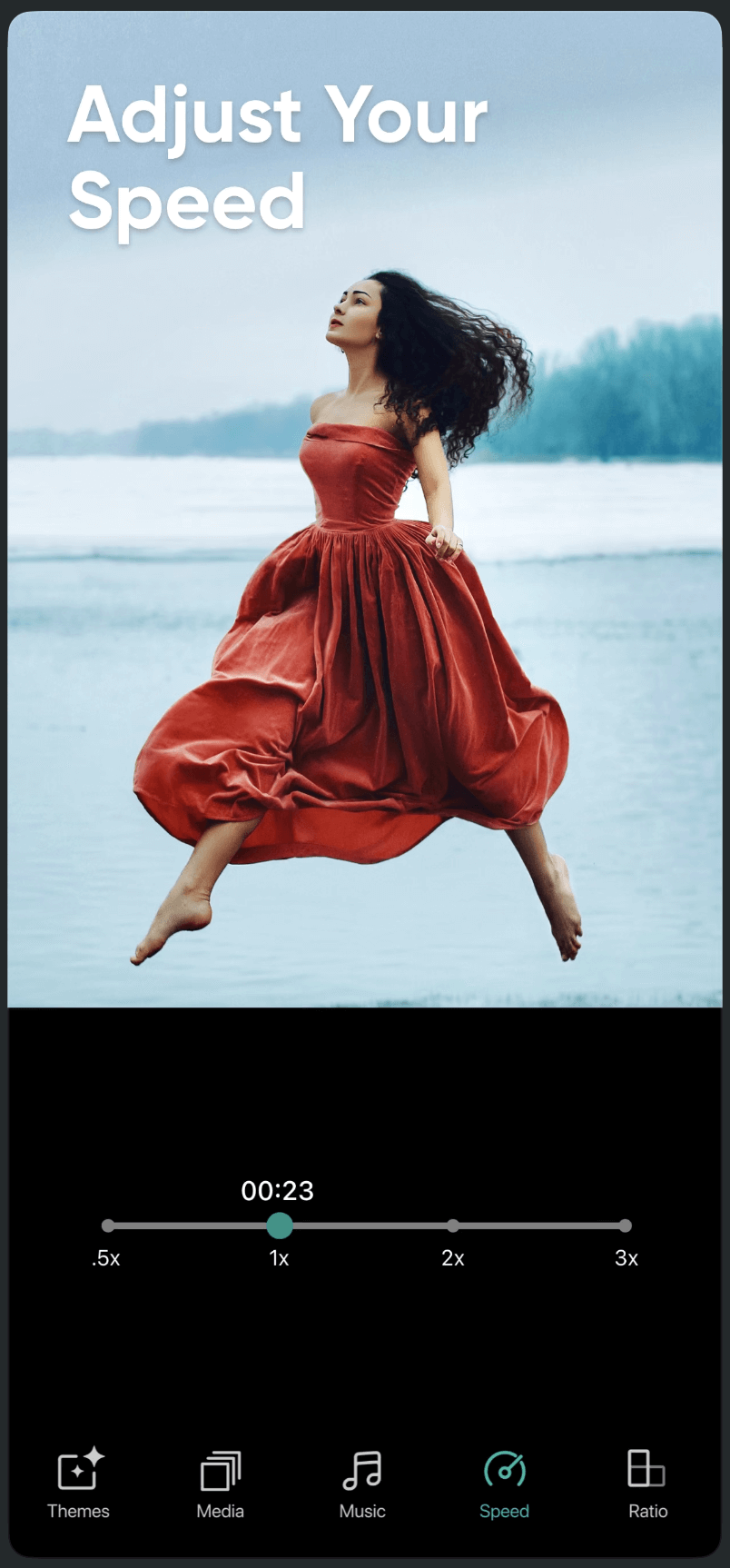
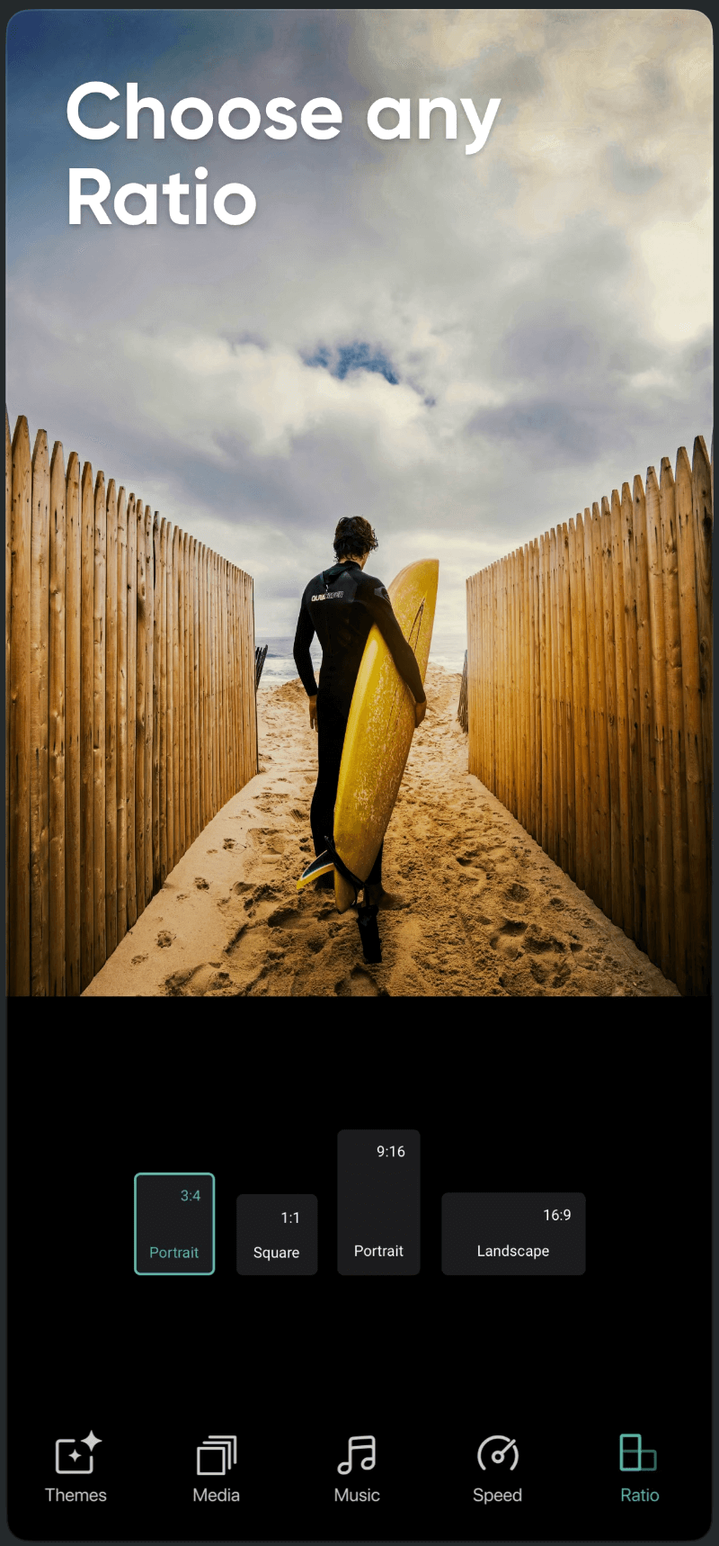
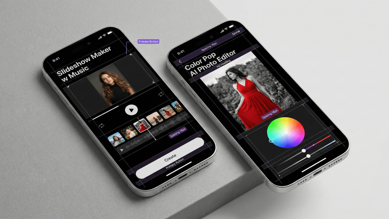
Slideshow Maker w Music
- Modular timeline editor
- Theme-based customization
- Advanced controls surfaced progressively
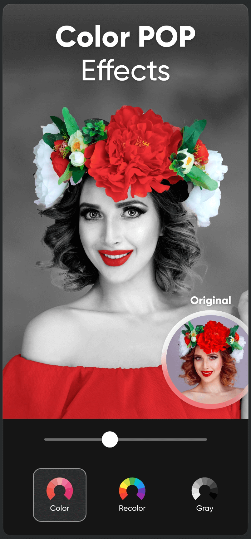
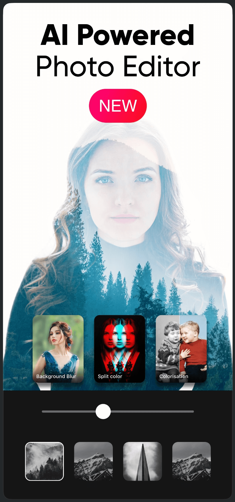
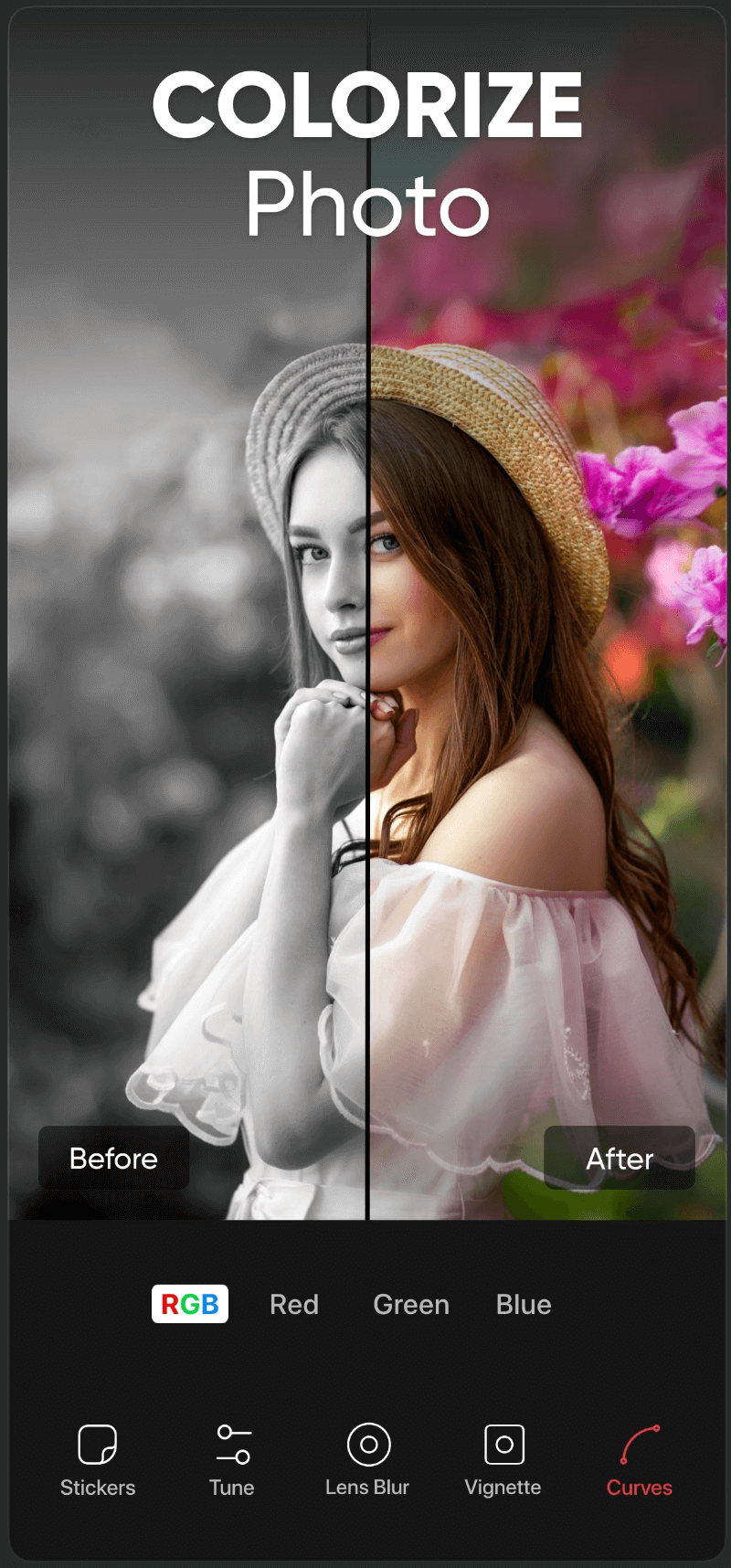
Color Pop: AI Photo Editor
- One-tap AI effects
- Minimal UI with familiar components
- Refinement controls using shared patterns
Different products, same system, zero relearning.
Side-by-Side Screens
Slideshow Maker vs Color Pop showing shared UI patterns
Slideshow Maker
Color Pop
Slideshow Maker
Color Pop
Slideshow Maker
Color Pop
Slideshow Maker
Color Pop
Slideshow Maker
Color Pop
Slideshow Maker
Color Pop
Slideshow Maker
Color Pop
Slideshow Maker
Color Pop
Slideshow Maker
Color Pop
Slideshow Maker
Color Pop
Collaboration
The system only worked because it was shared.
I Led
- 1Cross-functional design–engineering reviews
- 2Component alignment sessions
- 3Clear contribution and update workflows
- 4Documentation for designers and developers
The Result
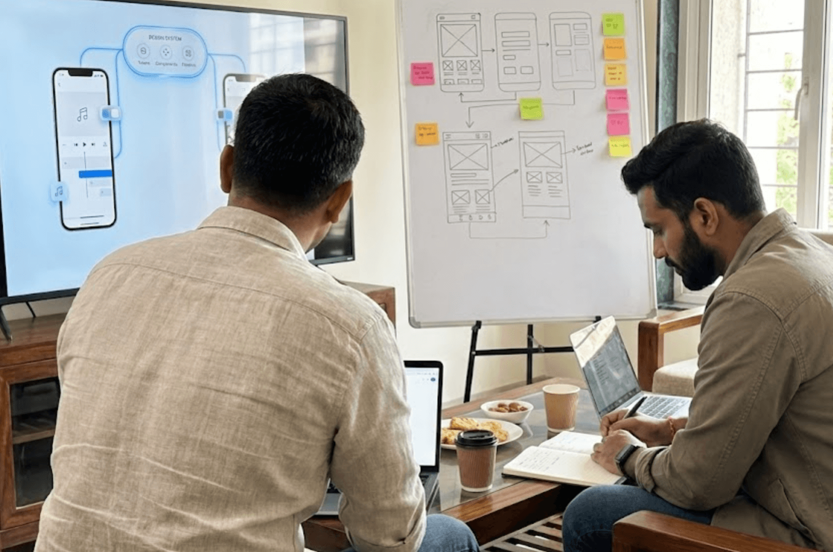
Team Workshop
Handoff Flow
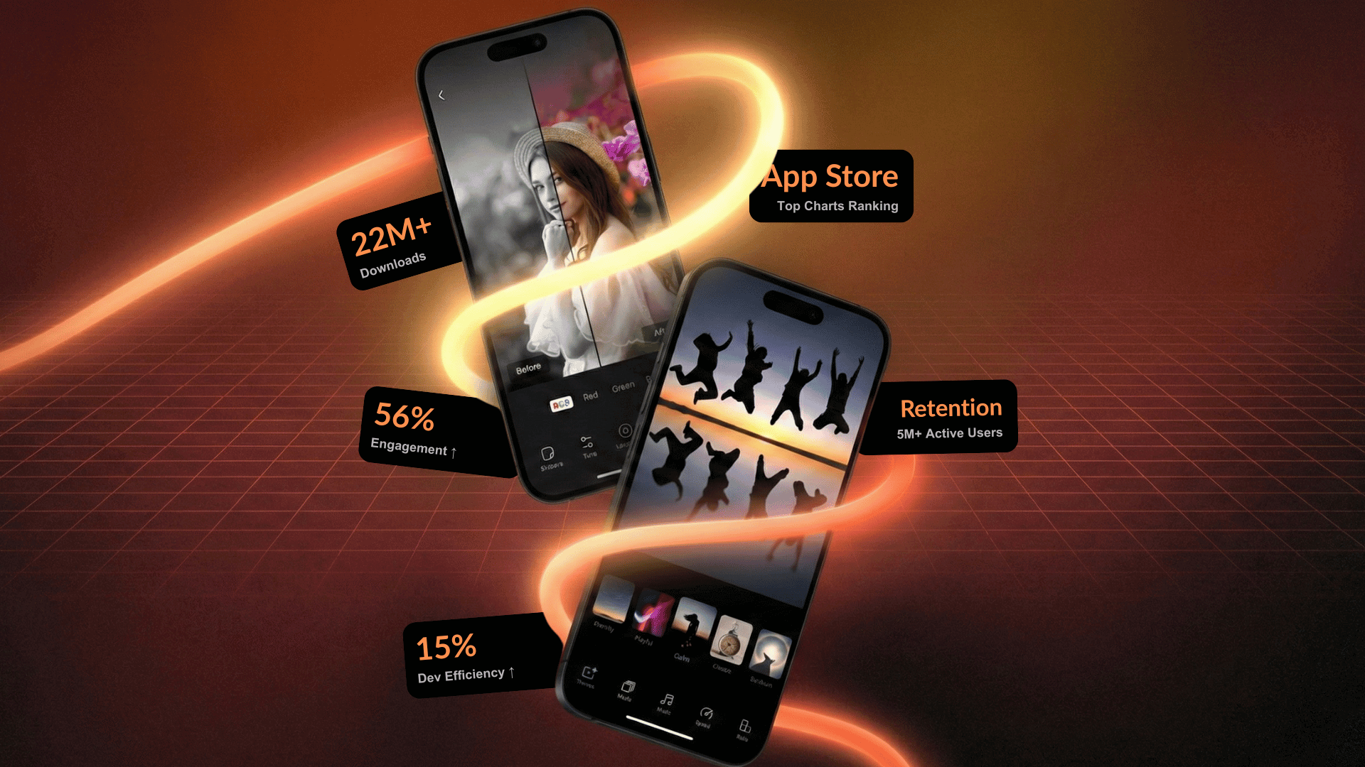
Impact
22M+
total downloads across the product suite
56%
increase in user engagement
15%
improvement in development efficiency
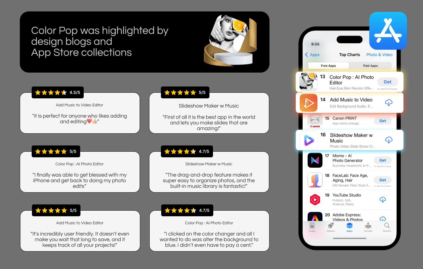
4.7★
average rating, featured by Apple
Top App Store Rankings
Sustained chart performance for years
The design system scaled with the product, and paid for itself.
Reflection
This project reinforced that:
Design systems are products, not assets
Consistency is earned through governance
Simplicity requires deep system thinking
Leadership is about alignment, not control
It changed how I design. Permanently!
This case study isn't about apps.
It's about scaling design quality across products, teams, and millions of users.
That's the kind of challenge I'm excited to solve next.
Thank you
Explore all projects